How to Create Graphs and Charts in Excel: The Basics
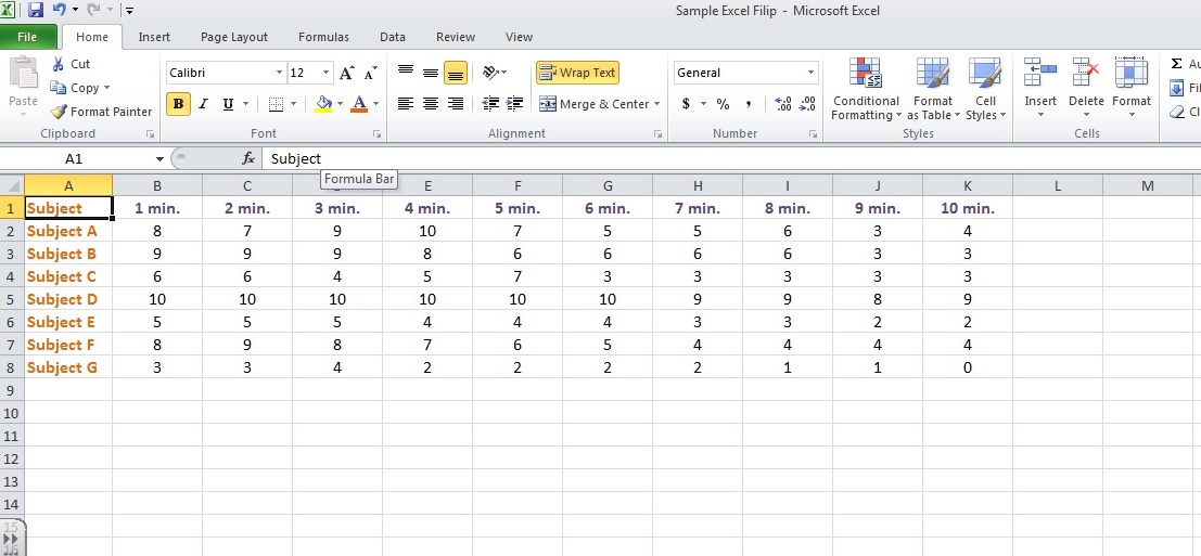
1. Organize your raw data in your spreadsheet, labeling your rows and columns:
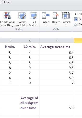
2. Do your calculations on the spreadsheet:
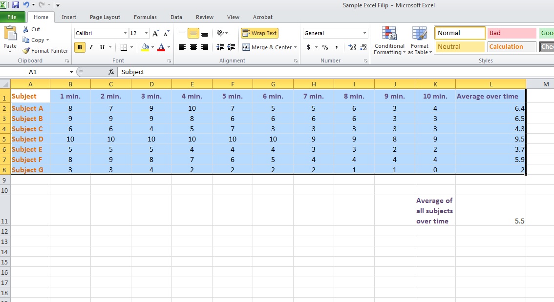
3. Select the data you want to include (you can change this later):
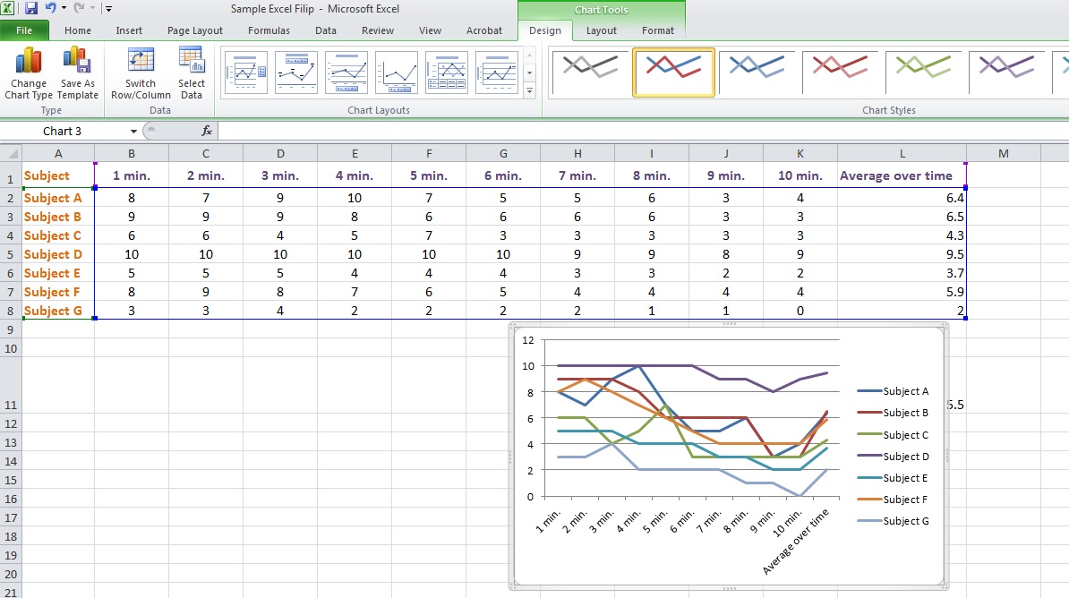
4. Choose type of graph (you can change this later): Main Menu → Insert
5. Decide on the best way to show your data (column, line, pie, bar, etc.?), and click on that graphic.
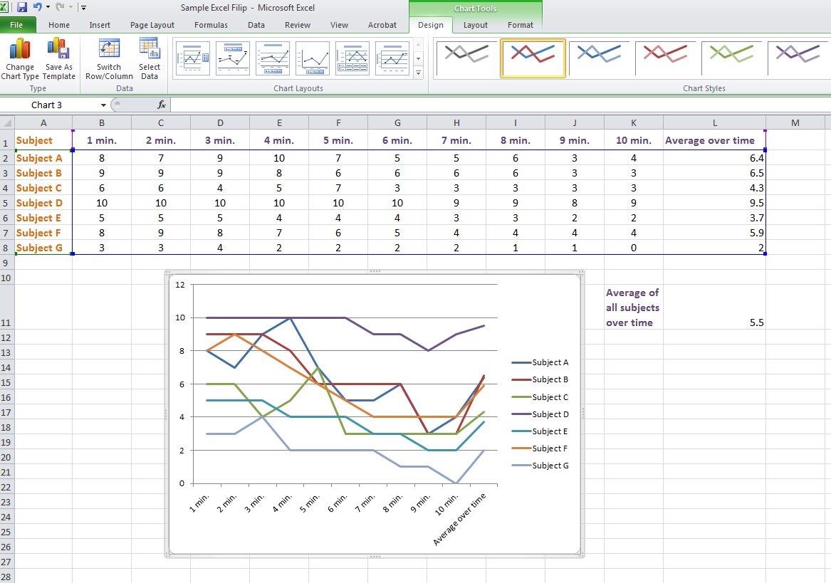
Example: Here is a line graph (you can change this later):
You can drag the graph around on the screen, and change the size and dimensions by dragging the corners or the sides.
When the graph is selected, notice that the main menu is on CHART TOOLS, and you are on the DESIGN tab.
CHART TOOLS (Design, Layout, Format) is where you will change the look of your design.
CHART TOOLS only appears when a chart is selected.
6. Practice resizing and moving your chart.
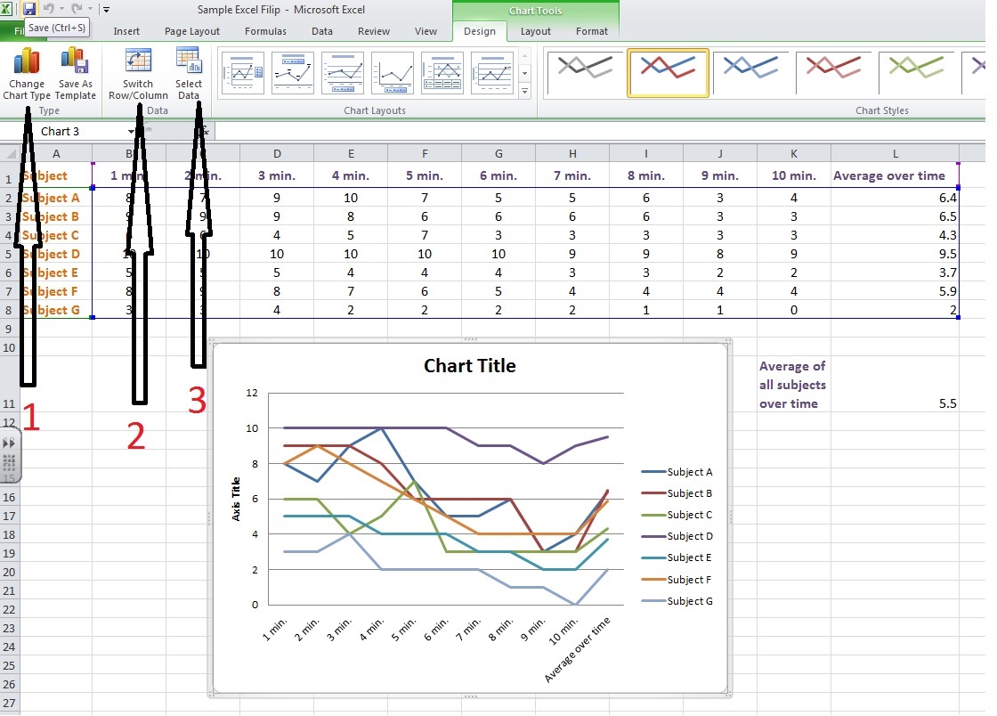
7. Practice editing the chart. Select the chart, and go to DESIGN tab. You are going to play with the DESIGN options in the top bar under the menu.
Change chart type: Play with different kinds of graphics in top bar under menu (CTR-Z after each change to cancel it)
Switch Row/Column: Change X and Y axes (CTR-Z after each change to cancel it)
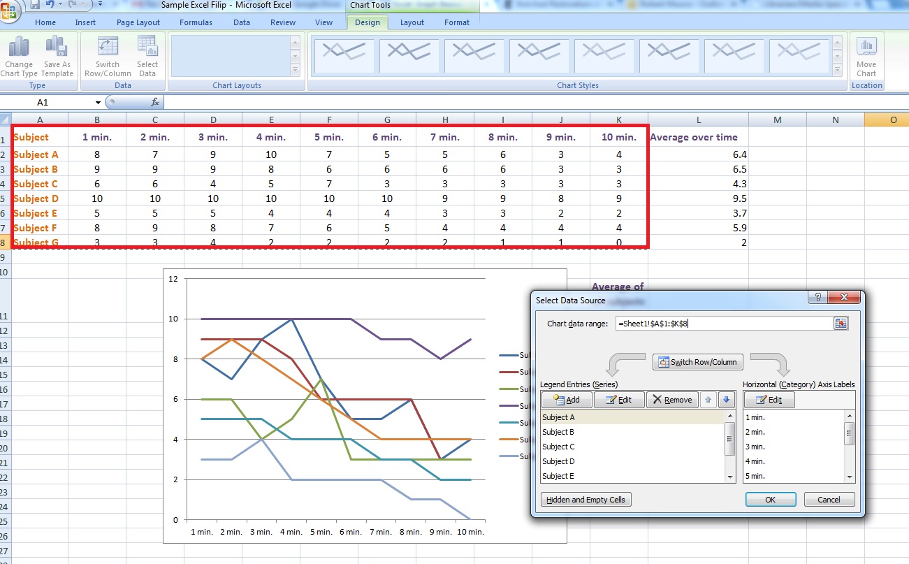
Select Data: Change your data range. Select a different data range, or CTR click individual cells. (CTR-Z after each change to cancel it)
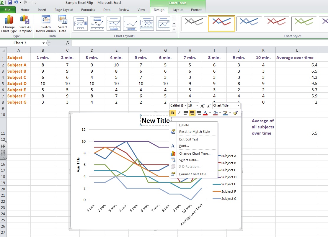
8. Chart Layouts: Play with different kinds of layouts (CTR-Z after each change to cancel it)
-Choose a layout with a title
-Change the title: click on the title and change the text.
-Change the axis title: click on the title and change the text.
-Format the chart title and axes titles: Right click to format. Play with the options.(CTR-Z after each change to cancel it)
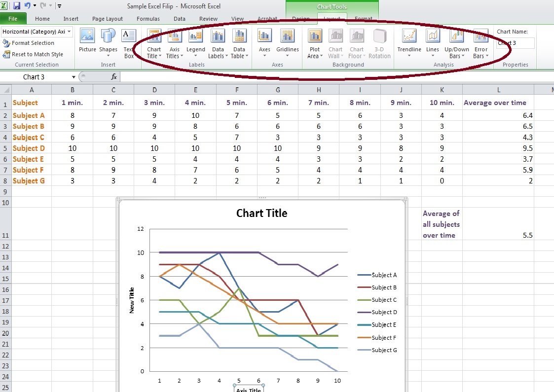
9. Add, Delete, Format, Edit axes, plot area, etc.: Select the chart, and go to LAYOUT tab. You are going to play with the LAYOUT options in the top bar under the menu.
Play around with the following options in the top bar under the LAYOUT tab:
Chart title
Axis titles
Legend
Data labels
Axes
Gridlines
Plot area
Don’t forget Trendlines (general pattern all data follows)
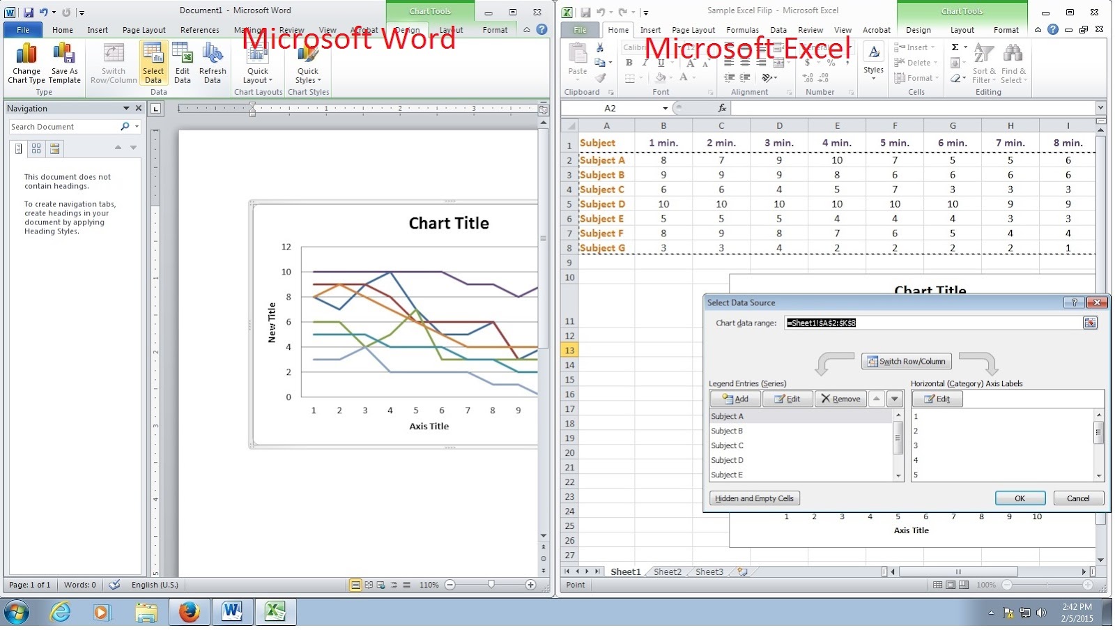
10. Transfer graph to other documents: Select chart, right click, copy, and paste in different document;
Hint: If you paste in a Microsoft product, you can generally activate the chart in the new document, which will open Excel so you can edit it.